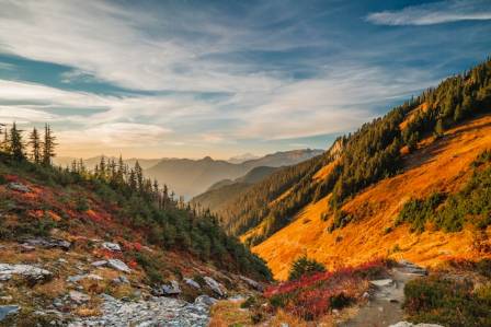
There’s something magical about autumn landscapes—their warm, fiery hues, the crispness of light, and the quiet nostalgia they evoke. For me, that magic became deeply personal when my wife Chontele and I spent our honeymoon in Arrowtown, a charming town in New Zealand’s South Island just 10 minutes from Queenstown, back in April. The golden aspens, rust-colored underbrush, and vibrant blue skies left an indelible mark, inspiring the first painting in a series dedicated to that unforgettable trip: New Zealand, Autumn Colors. In this guide, I’ll walk you through my entire process—from the initial spark of inspiration to the final brushstroke—sharing the techniques, tools, and creative choices that brought this autumn scene to life. Whether you’re a beginner looking to learn oil painting fundamentals or an intermediate artist seeking to refine your landscape skills, this step-by-step breakdown offers practical insights rooted in hands-on experience. (I’ve also shared a timelapse video of the painting for a visual companion—check it out here.)
Introduction: Inspiration from a Honeymoon Memory
Arrowtown is a postcard-perfect setting for autumn. Its tree-lined paths, historic cottages, and surrounding mountains transform into a riot of reds, oranges, and yellows as the season turns, creating a landscape that feels both wild and serene. When I snapped the reference photo for this painting, I knew I wanted to capture more than just the scenery—I wanted to convey the warmth of the moment, the way the light filtered through the leaves, and the sense of calm we felt during our honeymoon. Landscapes are as much about emotion as they are about accuracy; my goal was to translate that personal connection into color and texture, creating a painting that feels immersive and alive. This approach—rooted in personal experience—has always guided my work at Draw Paint Academy: art is most powerful when it’s authentic. As we dive into the process, keep this in mind: your best work will come from engaging with your subject, whether it’s a place you love, a memory, or a feeling you want to share.
The Reference Photo: Choosing and Adapting Your Subject
Every successful painting starts with a strong reference, but that doesn’t mean you need to copy it verbatim. The reference photo for New Zealand, Autumn Colors (which you can download as a high-resolution file here—feel free to paint your own version and share your results!) captured the core elements I wanted: a winding path leading the eye into the scene, a mix of deciduous trees in full autumn color, and a bright blue sky that contrasts with the warm foreground. When selecting a reference, look for clear focal points (the path in this case), a balanced composition, and a range of values (lights and darks) that will give your painting depth. I chose this photo because it had a natural flow—from the detailed foreground to the softer background—but I knew I’d make adjustments to enhance the visual impact. For example, I simplified some of the cluttered foliage, emphasized the contrast between the warm leaves and cool sky, and added subtle color accents to draw the eye. Remember: a reference photo is a starting point, not a rulebook. Your job as an artist is to interpret, not replicate.
Essential Supplies: Tools for Autumn Vibrancy
Having the right tools can make all the difference in oil painting, especially when working with the rich, varied colors of autumn. Here’s exactly what I used for this painting, along with why each item matters:
-
Brushes: I relied on Rosemary and Co brushes—their quality bristles hold paint well and allow for precise control. I used a few flat brushes for blocking in large areas, filberts for blending and creating soft edges, and a small round brush for fine details like twigs and dark accents.
-
Palette Knives: A set of palette knives was indispensable for mixing colors quickly and creating textured, impasto strokes—perfect for capturing the rough texture of leaves and bark.
-
Surface: I chose an Ampersand Gessobord (12 x 16 inches) for its durability and smooth, absorbent surface. Gessobord is ideal for oils because it doesn’t warp, and it provides a stable base for layering paint.
-
Paints: My color palette was curated to capture autumn’s warmth while balancing it with cool tones for contrast. I used ultramarine blue, cobalt blue, cadmium red, permanent alizarin crimson, magenta, cadmium yellow, cadmium yellow deep, cadmium yellow light, viridian green, cadmium green, transparent brown oxide, raw umber, and titanium white. Each color served a specific purpose: cobalt blue for the sky (bright and crisp), cadmium yellows and reds for the autumn leaves, and transparent brown oxide for the initial stain and warm undertones. For more details on my go-to supplies, check out my full supplies list.
Investing in quality materials doesn’t mean breaking the bank—focus on items that will enhance your process, like brushes that hold their shape and paints with rich pigment.
Step 1: Blank Surface – Visualize Before You Paint
Every painting begins with a blank surface, but the real work starts before you make your first mark. Before picking up a brush, I spent a few minutes visualizing the entire process: How would I approach the foreground? What colors would dominate the trees? How could I create depth between the sky, trees, and path? I also anticipated potential challenges—like avoiding a flat, two-dimensional look or keeping the autumn colors from blending into a muddy mess. This pre-painting visualization is crucial because it gives you a sense of purpose. Painting without a plan often leads to frustration and overworking, while a clear vision helps you make intentional choices. I imagined the final painting: vibrant but balanced, with textured foliage, a crisp sky, and a path that invites the viewer to step into the scene. This mental roadmap guided every brushstroke.
Step 2: Stain and Basic Sketch – Lay the Foundation
To avoid working on a stark white surface (which can make it hard to judge color values), I stained the Gessobord with transparent brown oxide. Using a large flat brush, I applied a thin layer of paint mixed with a small amount of mineral spirits, then wiped away excess paint with a paper towel. This created a warm, toned base that not only adds depth to the final painting but also helps unify the colors. The stain acts as a middle value, making it easier to gauge both lighter highlights and darker shadows as I build up the painting. After the stain dried, I sketched the basic composition with a light touch—just enough to mark the placement of the path, trees, and horizon line. I didn’t focus on details here; the goal was to establish the overall structure and ensure the composition felt balanced. A loose sketch gives you flexibility to adjust as you paint, whereas a tight drawing can feel restrictive.
Step 3: Foreground First – Build Momentum with Multicolored Strokes
I started with the foreground for a simple reason: it’s an easy entry point that lets me build momentum. The foreground is packed with detail—leaves, twigs, rocks, and shadows—but painting each element individually would be tedious and result in a stiff, unnatural look. Instead, I used multicolored strokes and broken color (a technique where small, distinct brushstrokes of different colors are layered without blending fully) to capture the complexity of the scene efficiently. I mixed warm yellows, reds, and oranges with touches of green and brown, applying short, energetic strokes to mimic the texture of fallen leaves and underbrush. Broken color works because the human eye blends the colors from a distance, creating a rich, dynamic surface that feels alive. This technique also saves time and keeps the painting feeling fresh—avoiding the “plastic” look that comes from overdetailing.
Step 4: Block In Trees and Path – Establish Shapes and Color
Next, I blocked in the basic shapes and colors of the trees and path. Blocking in is about laying down large areas of color without worrying about details—think of it as building the skeleton of the painting. I used restrained color choices here, focusing on middle values (not too light, not too dark) to establish a foundation. For the trees, I mixed various shades of yellow, orange, and red, using broader brushstrokes to define their overall form. For the path, I blended warm browns with hints of red and purple to reflect the autumn foliage above. I also introduced the palette knife at this stage: its flat, rigid surface is perfect for applying color quickly and creating texture without building up too much paint. I used the palette knife to block in sections of the trees and path, creating bold, expressive strokes that complemented the brushwork in the foreground. Blocking in is all about patience—resist the urge to add details too soon. A solid foundation ensures the rest of the painting flows smoothly.
Step 5: Crisp Blue Sky – Create Contrast and Depth
The blue sky is more than just a background element—it’s a critical part of the painting’s balance. It provides a cool contrast to the warm autumn colors, creating visual tension that draws the eye, and adds a sense of depth and space. For the sky, I mixed cobalt blue with titanium white. Cobalt blue was the perfect choice here: it’s bright, crisp, and has a cool undertone that contrasts beautifully with the warm foliage. Ultramarine blue, another blue on my palette, is slightly warmer and darker—using it would have made the sky feel heavy and muted, which didn’t fit the bright, airy mood I wanted. This small decision—choosing the right blue—highlights how even minor choices can dramatically impact the final result. Painting is full of these nuanced decisions, and they’re what make the process both challenging and rewarding. I applied the sky with a large flat brush, using long, horizontal strokes to create a smooth, expansive look. I kept the sky lighter near the horizon and slightly darker at the top to mimic atmospheric perspective (the way objects appear lighter and less detailed as they recede into the distance).
Step 6: Add Lighter Colors – Build Variance and Dimension
With the foundation in place, I added lighter colors to the trees and path to create variance and depth. This step transforms flat color shapes into three-dimensional forms—turning blobs of yellow into sunlit leaves and blocks of brown into a winding path. I was careful to introduce lighter colors gradually, following the advice of John Singer Sargent, one of the greatest oil painters of all time: “You must classify the values. If you begin with the middle-tone and work up towards the darks – so that you deal last with your highest lights and darkest darks — you avoid false accents.” Sargent’s wisdom is invaluable here: starting with middle values and slowly building up lights and darks prevents you from overstepping (making colors too light or too dark) and having to fix mistakes later. For the trees, I added highlights of cadmium yellow light and titanium white to areas where the sun would hit the leaves. For the path, I mixed warm browns with more white to create highlights on the edges and where light reflects off the ground. This gradual build-up of value creates a sense of volume and realism.
Step 7: Clean Up with a Brush – Refine and Blend
The palette knife strokes from the blocking-in stage were bold and expressive, but they needed a bit of refinement to integrate seamlessly with the rest of the painting. I used a clean brush to soften some of the harsher edges, blending palette knife strokes with brushwork to create a cohesive look. This combination of tools works beautifully: the palette knife adds texture and energy, while the brush adds precision and softness. For example, I used a filbert brush to blend the edges of the tree shapes, making them feel more organic, and a small flat brush to clean up the lines of the path, ensuring it remained a clear focal point. This step is about balance—knowing when to keep bold strokes and when to soften them. It’s also a chance to create interesting marks: by weaving brush and palette knife strokes together, you add layers of texture that make the painting feel more dynamic.
Step 8: Dark Accents – Anchor the Painting
Next, I added dark accents to represent trees and leaves in shadow. These darks are crucial—they anchor the painting, provide contrast for the lighter colors, and help define shapes. Without dark accents, the painting would feel flat and washed out, with all the colors blending together. I mixed transparent brown oxide, raw umber, and a touch of ultramarine blue to create rich, warm darks (avoiding pure black, which can feel harsh and lifeless). I applied these darks with a small round brush, focusing on areas where leaves overlap, the bases of trees, and the shadows along the path. These accents create depth by pushing certain elements back (like the dark trees in the background) and pulling others forward (like the light leaves in the foreground). I also used dark accents to add definition to small details, like twigs and gaps between leaves. Remember: darks don’t have to be perfect—imperfect, organic strokes feel more natural in a landscape.
Step 9: “White” Bark – Use Cool Grays for Realism
One of the most common mistakes artists make when painting tree bark is using pure titanium white—it looks artificial and out of place. The “white” bark on the trees in this scene is actually a light, cool gray. I mixed titanium white with a tiny amount of viridian green and ultramarine blue to create a gray with cool undertones that complemented the warm autumn colors. My approach was rough and textured, mimicking the look of dead, weathered bark. This rough application also fits the impressionistic style of the painting—loose, expressive strokes that suggest detail rather than spell it out. I used a small round brush to dab and drag the gray paint along the tree trunks, creating uneven, natural-looking bark. I focused on the upper parts of the trees, where the bark would be more exposed to the elements, and kept the lower parts darker to maintain the sense of shadow.
Step 10: Add More of Everything – Increase Complexity
At this stage, the painting was taking shape, but it needed more complexity and sophistication. I spent time adding more lights, more shadows, more colorful accents, and more intricate details. For example, I added small touches of magenta and crimson to the leaves to enhance their autumn vibrancy, layered additional highlights on the path to make it feel more three-dimensional, and added subtle shadows under clusters of leaves to create depth. I also paid attention to the relationship between elements: ensuring the shadows on the path matched the direction of the light from the sky, and that the colors of the leaves echoed in the path’s reflections. This step is about refinement—not overworking, but adding small, intentional details that elevate the painting. It’s also a chance to trust your intuition: if a area feels flat, add a pop of color; if it feels too busy, simplify.
Step 11: Refine and Detail – Put It All Together
The final stage of the painting is all about refining and detailing, working your way around the canvas to ensure everything harmonizes. This is a dynamic process—tinkering, adjusting, and making small tweaks until the painting feels cohesive. Here are a few key moments from this stage:
-
Scumbling highlights: I used a dry brush technique called scumbling (dabbing a dry brush loaded with light paint over the surface) to add flickering highlights to the leaves, mimicking the way sunlight filters through foliage.
-
Enhancing the sky: I used a palette knife to add a few more strokes of cobalt blue and white to the sky, making it more prominent and crisp.
-
Painting thin branches: I used the edge of a palette knife to create thin, dark lines for tree branches—quick, precise strokes that add detail without cluttering the scene.
-
Reiterating dark accents: I used a small round brush to reinforce dark accents in key areas, like the base of trees and overlapping leaves, to keep the painting grounded.
-
Adding a pop of turquoise: Intuition played a role here—I added a touch of cobalt turquoise to the foreground, not for logical reasons, but because it felt right. It added a subtle, unexpected color accent that drew the eye and enhanced the overall vibrancy of the scene.
This stage is about balance—knowing when to stop. It’s easy to overdetail, but the best landscapes leave room for the viewer’s imagination. I stopped when the painting felt complete: the colors popped, the composition flowed, and it captured the emotion of that autumn day in Arrowtown.
Step 12: Sign the Finished Painting
The final step was signing the painting. I used magenta (a color that echoed the autumn foliage) and a small round brush, signing in the bottom right-hand corner. The thick, impasto texture on the surface made clean strokes challenging, so I kept my hand relaxed and loaded the brush with enough paint to ensure the signature was visible. Due to the dark background, the signature is subtle—but that’s okay. A signature should be a gentle addition, not a distraction. Signing a painting is a moment of pride—it’s a way to claim your work and celebrate the journey you’ve taken to create it.
Final Reflections: The Joy of Imperfection
Painting New Zealand, Autumn Colors was a challenge—capturing the complexity of autumn foliage, balancing warm and cool colors, and creating a sense of depth—but I’m thrilled with the result. The colors have the “pop” I wanted, the composition guides the viewer’s eye through the scene, and it still retains a freshness that feels true to the moment. Of course, there’s always room for improvement: I could have been more efficient in my blocking-in stage, and I could have refined the play of light and shadow on the path further. But that’s part of the artistic process—every painting is a learning experience. What I love most about this piece is that it’s more than a landscape; it’s a memory made tangible. The warm colors evoke the feeling of autumn in Arrowtown, the path invites the viewer to step into our honeymoon moment, and the crisp sky captures the brightness of that day. Reading your comments—hearing that the painting feels “warmer than the photo,” “3D,” and “inviting”—means the world to me. It’s a reminder that art is about connection, both for the artist and the viewer.